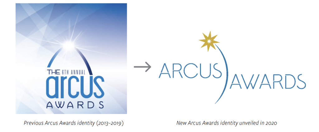
The St. Louis Regional Chamber’s Arcus Awards recognizded organizations in the 15-county, bi-state St. Louis metropolitan area that demonstrated their dedication to making our region a better place to live, work, and invest. In 2020, for its 7th annual Arcus Awards, the Chamber chose to refresh the event’s brand. I was responsible for re-designing the event’s branding and applying it to printed collateral, digital assets, event signage, and even branded motion graphics.
Logo Design Process
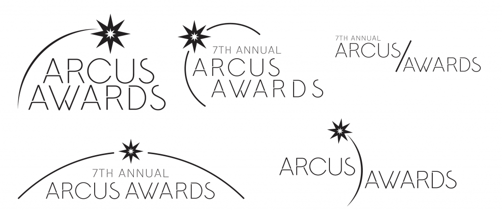
I was asked to design a logo that would be close enough to the original to be recognizable, while looking more modern and glamorous. Specifically, I was given music and film award ceremonies to use as a reference for look and feel (the Academy Awards, the Grammys). I retained the starburst in the logo and abstracted the arch motif to look more like a shooting star. I also simplified the elaborate light-beams background from the original materials to a cleaner, more colorful gradient, which we applied to almost all Arcus materials.
Logo Design Round 1
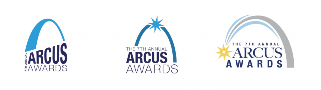
Logo Designs Round 2
The starburst motif was a favorite among the early logo designs. Once I honed in on that direction, the logo stared coming together. Also, finding the right typeface, the sparse but lovely sans serif Amundsen, really gave the identity a distinctive character.
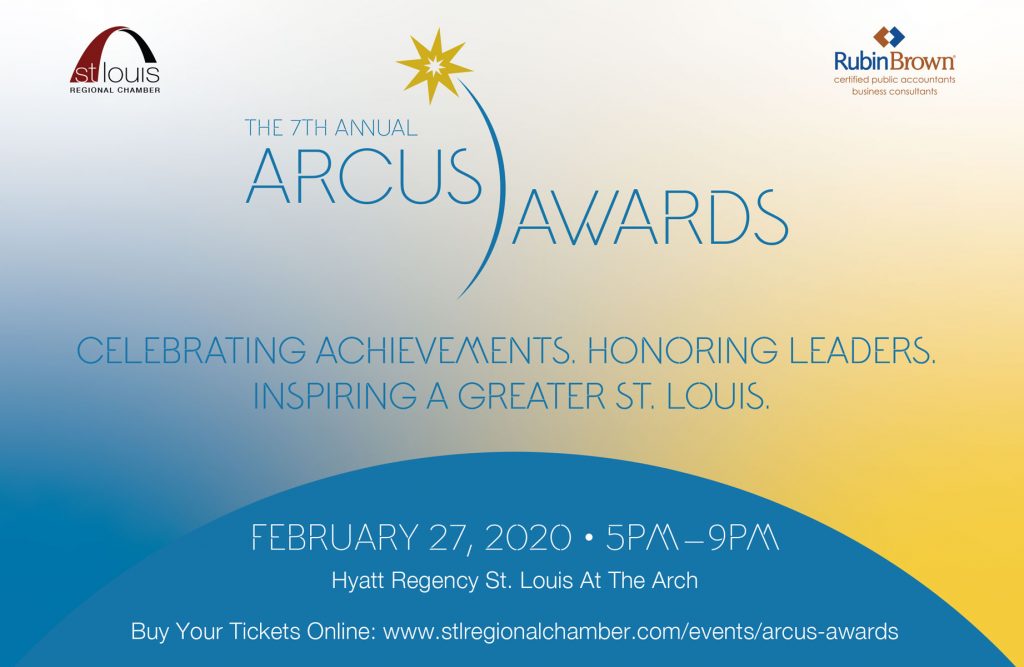
Printed Collateral
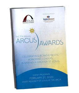
Arcus Awards event program 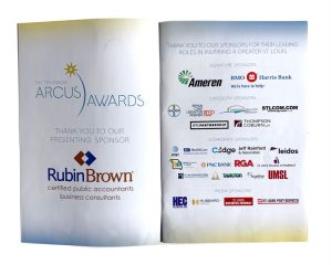
Arcus Awards event program 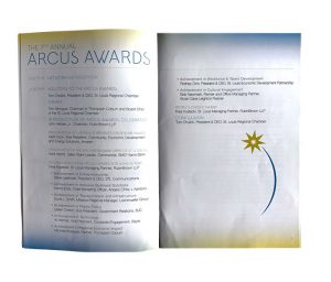
Arcus Awards event program
Motion Graphics
During the Arcus Awards event, the St. Louis Regional Chamber had a gigantic media wall on stage, and they asked me to design branded looping motion graphics to display as people entered the ballroom and during intermissions.