I worked with A Dose of Insight, a boutique marketing agency, to develop a brand identity for Gisele Marcus, The Connection Champion — a networking expert who shares her insights as a speaker and workshop leader. For the identity design, we wanted a professional look that was appropriate for corporate settings, while still maintaining the personal touch that Marcus emphasizes in her training sessions.
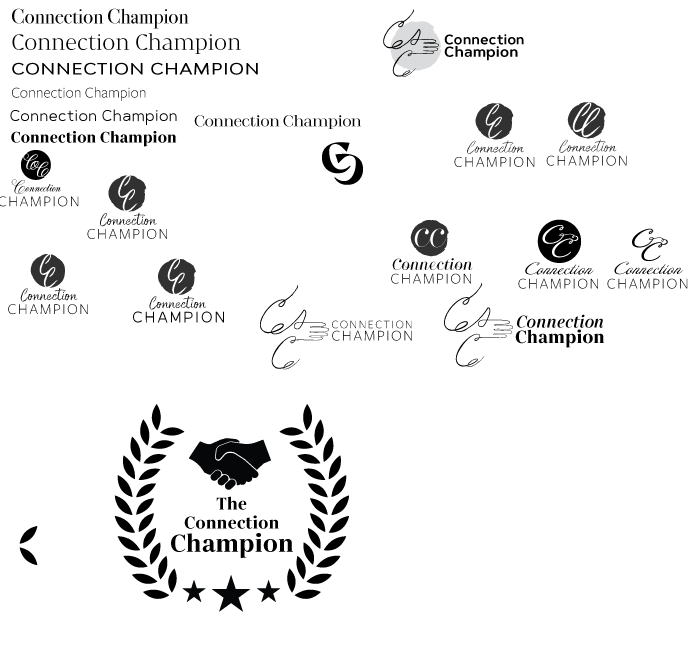
Logo Design Round 1
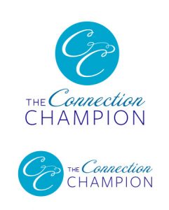
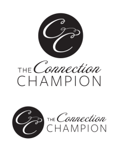
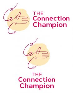
Logo Design Round 2
We decided that having a hand-lettering style script typeface was important for the Connection Champion identity, because it evoked the feeling of warmth and personal connection that the brand needed. So for the second round of design, I focused on working out some typography combinations that balanced personality with professionalism. I quickly drew the interlocking speech bubble icon to use as a placeholder above the type block, but the client ended up liking it so much that we incorporated it into the identity design!
Logo Design Round 3
We landed on a type combination we liked, so for the next rounds of design, I mostly just refined the small details of the design.
Final Branding Guide
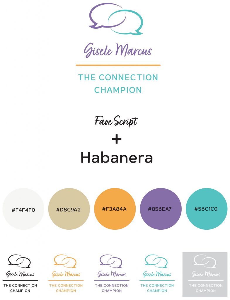
With the logo design complete, I was ready to assemble the branding guide! The color palette was provided by the client.
Branded Collateral
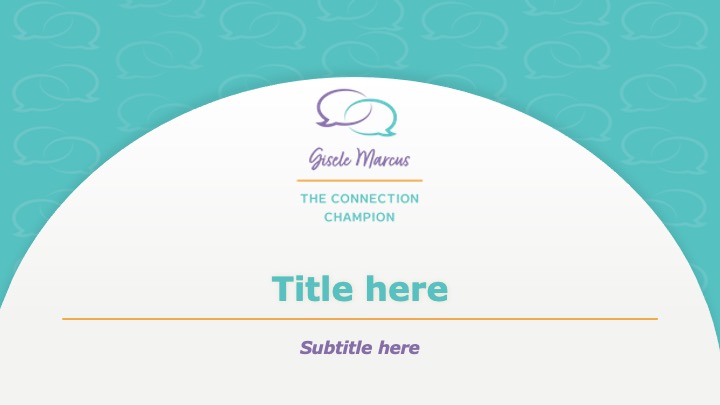
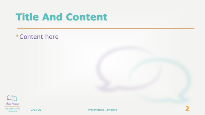
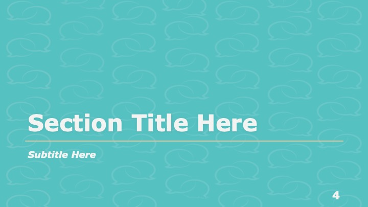
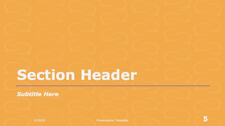
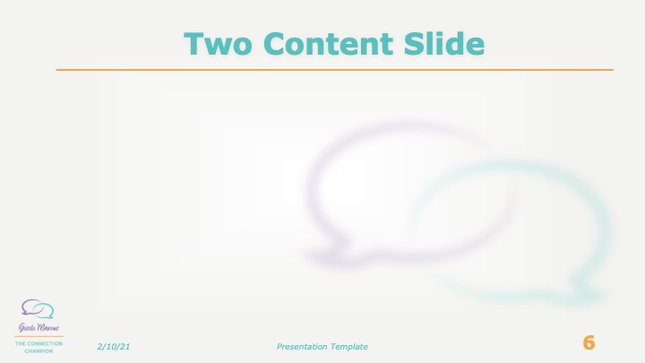
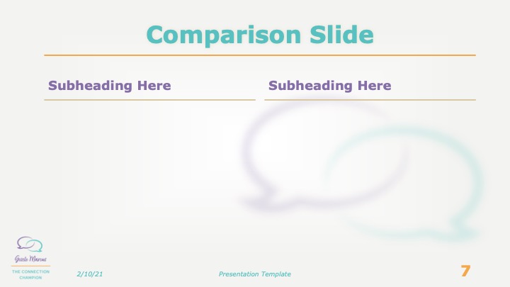
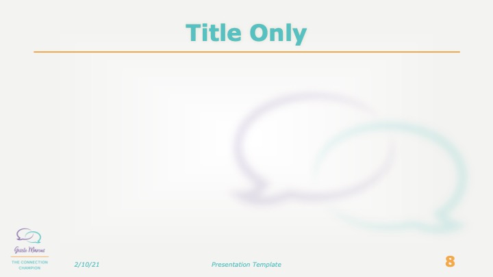
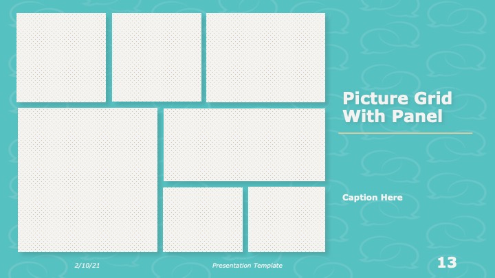
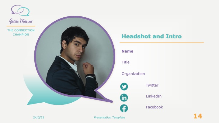
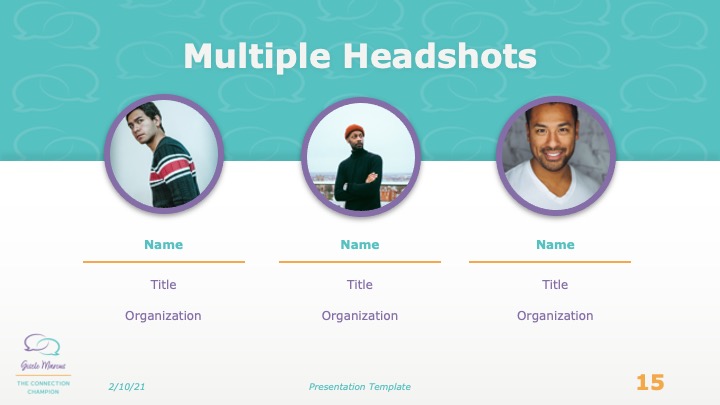
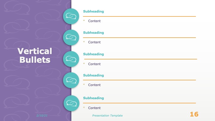
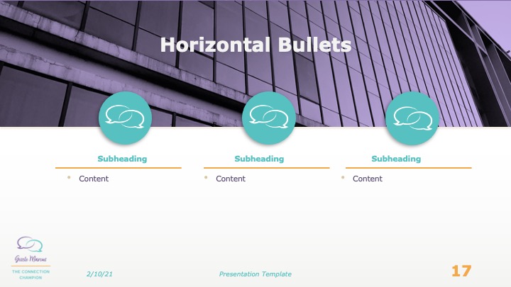
Part of the branding package requested by the Connection Champion was a branded slide deck template. I developed a Powerpoint template that featured the Connection Champion color palette, logo, and typography. I adapted the interlinked speech bubbles icon into a repeating pattern to add texture to areas of solid color, such as section headers.
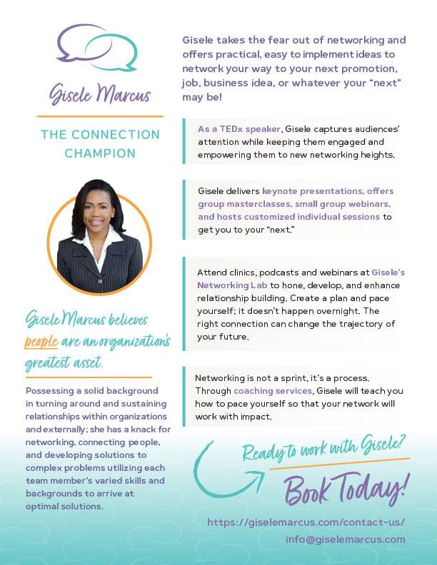
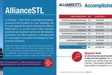
A sales sheet was another important component of the Connection Champion branding package.



0 Comments