Pat Coleman LLC, an umbrella of consulting businesses, needed logo and identity designs for both the business’s parent company, Pat Coleman LLC, and BlessZings, the first sub brand of the parent. The Pat Coleman LLC identity design needed to be broad enough to accommodate future sub brands and companies
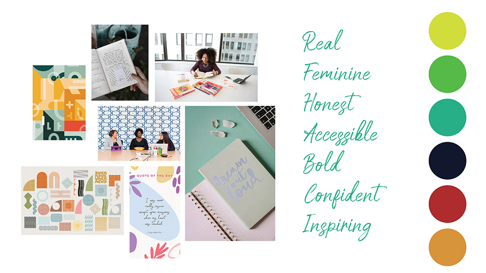
Below is the original moodboard I developed for the Pat Coleman LLC brand, which was used as a touchstone for the rest of the brand development process. Key words in identity development include bold, confident, inspiring, and accessible.
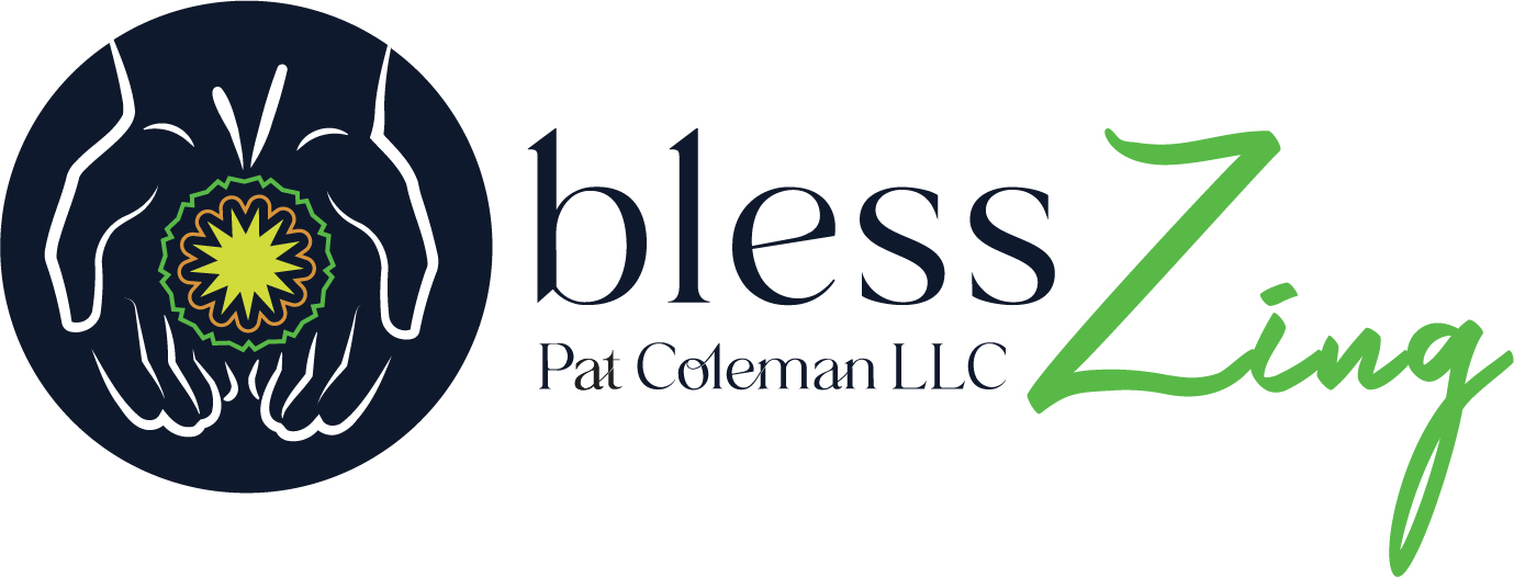
The original Pat Coleman LLC word mark needed to be kept simple, so it could be easily combined with future sub-brands. When it came time to design the logo for BlessZing, the first brand in the Pat Coleman LLC portfolio, I had more leeway to design a more complex logo. I created an icon that conveyed the idea of sharing inspiration, while hinting at spirituality without being overtly religious.
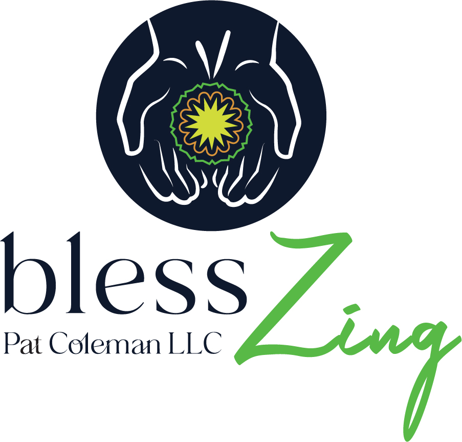
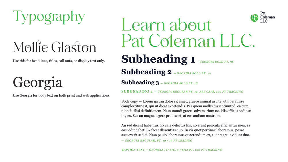
In addition to designing a logo, I built out the brand identity further by developing the brand typography and color palette. For Pat Coleman LLC and its sub-brands, I chose Mollie Glaston as a featured typeface for logos, headlines, titles, and other display text. Mollie Glaston combines the adaptability of an all-purpose sans serif with the uniqueness of a decorative display type through its interesting ligatures. I felt that this typeface would be versatile enough to apply to several different brand identities, while being unique enough to add character and evoke the personal touch a good consulting business should have.
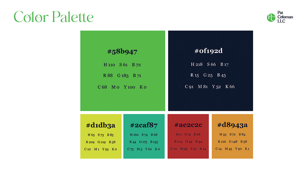
The color palette for Pat Coleman LLC features several greens, which evoke creativity and personal growth. The vibrant colors are anchored by heavy use of a cool black, which keeps everything professional and business-focused.


0 Comments